


A period to learn, earn a certificate, and connect with the Fabric community. It’s a 50-day journey packed with learning, sharing, and even a contest to test your knowledge.
Since I’ve been working with Fabric for almost two years, it was time to take on a challenge! There was a notebook contest available to dive into the Cities of Tomorrow:
Notebooks Contest | Fabric Data Days - Microsoft Fabric Community
Long story short: it was all about turning an unknown dataset into something meaningful: using a story-driven interpretation of a notebook so the data feels alive and the results are explained in a fun, easy-to-understand way.
And that’s exactly what I did: I built a notebook to explore the data and tell its story.
The challenges is scored around 5 area’s
- Data Cleaning & Preparation
- Exploratory Analysis
- Modeling / Advanced Analytics
- Storytelling & Clarity
- Creativity & impact.
For the primary dataset, we used one from Kaggle: Sustainable Urban Planning & Landscape Dataset – Kaggle. In simple terms, it’s a collection of numbers that score cities across different sustainability factors.
The goal? Highlight which factors matter most, uncover relationships, make predictions, and share advice, in the smartest and most beautiful way possible.
After installing a few extra packages and importing them, I downloaded the dataset and loaded it into a pandas DataFrame to see what we were working with.
Next, I did some quick stats, renamed a few columns, calculated mean and standard deviation values, and re-scaled certain numbers to make them easier to interpret. All of this was done with some basic Python magic. In total, the dataset contains 3,476 unique records.

Snipping of the data
After that, the real fun began, and my learning curve shot up! Why? Because I don’t do data science every single day, so I had to refresh my skills and dive back into some feature engineering to explore the data properly.
To start with a solid base, I created histograms to check the data distribution. Most features looked nicely balanced, except for the Livability Index, which showed a near-normal distribution. That makes sense, it’s the main “end score” for a city and acts as the Y variable in a regression model.
The rest of the data seemed pretty normalized, but that only means one thing: time to dig deeper!

Livability Index
Now let’s check if we can find some correlations between the data. With easily running the following python code to make a correlation check. The results are plotted below.
correlation = df_clean[columns_check].corr()

This chart already reveals some fascinating relationships: both strong and negative. And honestly, they make perfect sense!
For example, it’s pretty obvious that better green space coverage boosts the livability index. On the flip side, a higher crime rate drags it down (no surprises there).
Both of these relationships can be visualized beautifully with regression plots. Check them out below:
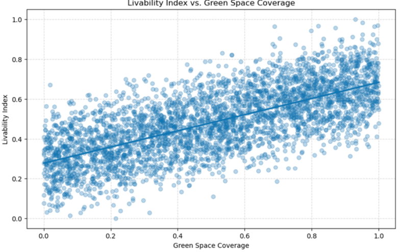
Green space coverage

Crime rate
When we dig deeper into the relationships, scatter plots come to the rescue! They let us add a third dimension and see how factors interact together.
For example: even if Carbon Footprint is low, a high Disaster Risk Score still slashes livability! You can clearly see this in the plot below.
Personally, I love this visualization. The coolwarm color palette makes it super intuitive: red screams “danger zone,” showing that higher disaster risk has a strong negative effect.

Scatterplot to see Carbon Footprint and Disaster Risk Score together.
Python code:
sns.scatterplot(x='Carbon Footprint', y='Livability Index', data=df_clean, hue='Disaster Risk Score', sizes=(20, 200), palette='coolwarm')
All these insights, and more, can be found in my full notebook for completeness.
These insights are great and already reveal some valuable information—but we’re not done yet! It’s time to dive deeper with some advanced analytics.
To kick things off, let’s build a few regression models. In my notebook, I explored the top and bottom 10% of cities to see how they differ from the global average. Now, I want to zoom in on the regression model that predicts a city’s livability.
For the model, I have chosen to focus on the following columns:
key_columns = [
'Green Space Coverage', 'Renewable Energy Share', 'Public Transport Accessibility',
'Carbon Footprint', 'Crime Rate', 'Disaster Risk Score', 'Livability Index'
]
We split our data into two parts:
- Training set (80%): where the model learns patterns.
- Test set (20%): where we check if it really understood the lesson.
Then we unleash a Random Forest Regressor: think of it as a team of decision trees working together. Each tree makes a guess, and the forest votes on the final prediction. Why a forest? Because many trees are smarter than one! That’s a simple explanation 😉.
As a result we have achieved a R² Score (Explained Variance) of 0.955. This means the model explains 95.5% of the variance in the data, indicating excellent predictive accuracy.
The RMSE (Root Mean Squared Error)is 0.037 The average prediction error is very low (around 0.037 units), showing the model’s predictions are highly precise.
It was really cool to observe these kind of results while modeling this. Before running this, I did not expect such a good fit of the regression model, which made me very happy.
Additionally, we can split the data in Foundational, Developing, and Thriving cities to to plat them and gain more insights as well. Grouping is, we see definitely a split in factors, and we can conclude that Green space coverage grows consistently across tiers, for example.
As a last part, I performed a Monte Carlo simulation. This is a technique for estimating outcomes by running many random experiments and observing the results. The Monte Carlo simulation is about how livable a city is, based on a mix of factors like green space, public transport, energy, and the less fun stuff, crime, carbon, disasters. Think about rolling the dice 10,000 times to see how the city’s vibes turn out.
To perform this, we are execution the following steps:
- Making and average city
- Creating feature importance coefficient and their impact
- Roll the dice 10.000 times
- Build the index
- Judge the results
- Visualize it
Each future scenario reshuffles the mix of green space, renewable energy, transport, carbon, crime, and disaster risk, because in reality, nothing stays fixed. Monte Carlo simulation helps us explore this uncertainty.
- Average Livability Score: 0.504, close to the global norm.
- 95% Confidence Interval: 0.344 to 0.667, meaning cities could range from struggling (0.34) to thriving (0.67).
That’s a big swing, and it all depends on how much we invest in sustainability and resilience.

Monte Carlo Simulation
Urban livability isn’t fixed, it’s a spectrum shaped by choices. And now, we know which levers matter most.
In short as the big takeaway: The City of Tomorrow isn’t built on slogans, it’s built on data-driven choices. Add green, cut carbon, embrace renewables, and prepare for the unexpected. Do that, and your city won’t just survive, it will thrive.
After drink
This challenge reminded me of something important: I can still learn new things every single day!
Sure, data science is my background, but using it like this isn’t part of my daily routine. So, diving into the data, visualizing it with plots, and running extra analyses turned out to be… actually pretty cool.
Maybe I should do this more often. What do you think? 😎
Do you want to know / read more? Please check my full notebook here: https://github.com/bbreugel/NotebookCityOfTomorrow/blob/main/Nov2025_BenitovanBreugel_CitiesOfTomorrow.ipynb